05 Jul Sonra’s Advanced Data Visualization Tools
Sports data visualization has been a powerful method of data analysis in sport. Existing evidence suggests that successful data analysis can have a positive impact on team performance through player scouting, conditioning training, opposition analysis and more.
Visualizations can be more accessible and insightful than traditional statistical data, which has led current sports scientists and practitioners to rely on data visualization to explore, communicate and, ultimately, make decisions to improve performance.
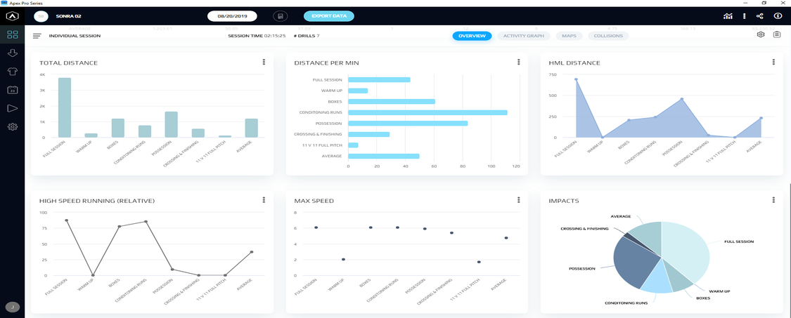
The new Apex Pro Series software has incorporated an important feature which will provide practitioners with a new form of visualizing data. The Metric Dashboard can display data for multiple players, sessions and drills which can be customized to fit the team’s requirements. These are displayed within four sections:
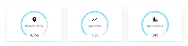
At the top of the dashboard, up to six Gauges can be selected for viewing. These indicate the average value of the sessions or players selected (in case of selecting Individual Session, it will display the sum of the value in each drill). The blue line around the gauge indicates the value of the measure in relation to a set threshold.
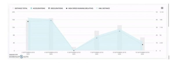
The second segment displays a Combination Chart with up to five metrics. Combination charts are useful where you want to validate the relationship between several variables that have different magnitudes and scales of measurement but are related in a meaningful way.
On top of the chart, the metrics displayed can be toggled on and off for a more dynamic viewing of the graph. These can be represented as column, line or area charts for a cleaner visualization, and either as percentage or absolute values. The “Stacking” option can be selected when the objective is to view the segments or categories that compose a whole e.g. high-speed distance and low-speed distance of a training session.
Under the combo chart is the Metric Table. This table is a summary of the variables selected for the player(s) or session(s) and displays the number values of each.
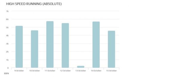
Finally, at the bottom of the Dashboard, a maximum of 30 individual Metric Charts can be displayed for the chosen measures. The chart type can be expressed as column, bar, line, area, pie or scatter, which are applied depending on the characteristics and purpose of the data set. It is important to know the purpose of each chart type when assembling a performance report ensure correct interpretation of data.
Choosing the Right Chart Type
Column: a column chart is used to show a comparison between different items, or to compare the items over time. E.g. the weekly load of a team’s high-speed running.
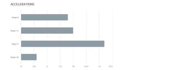
Bar: a bar graph can be used when there are less than 12 items to compare which on a single time period. E.g. the number of accelerations done by the attacker’s group in a match.
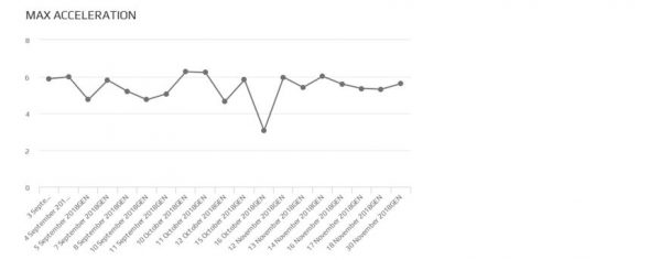
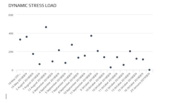
Line: a line graph is used to visualize the value of something over time. E.g. a player’s max acceleration achieved during a 3-month period.
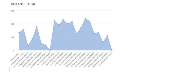
Area: area charts are a good choice when you want to show a trend over time but aren’t as concerned with showing exact values. E.g. the total distance covered by a player in training throughout several months.
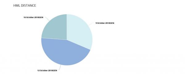
Pie: a pie chart represents the composition of something, where the sum of all segments equals 100% of the measurement. It is best applicable when there are few categories and the pie chart can ensure differentiation between slices. E.g. the HMLD of a player in three different matches.
Scatter: scatter plots have the purpose of showing the correlation between two variables, so it should be used when the purpose is to show how much one variable is affected by another. E.g. the DSL of a player during a conditioning programme.
Analysis and reporting of data are highly influenced on the visualization format used and choosing the wrong visual aid could cause confusion or lead to mistaken understanding of data. Therefore, it is important to select the chart type appropriate to the variables included for visualization and analysis.
It is of interest of the user to know that there are also different ways of viewing the dashboard, depending on the players and sessions which are to be included.
Methods of Analysis
As in the previous software version of Apex, the dashboard can be viewed for different sets of selected data. This enables the user to choose between viewing a single or multiple player or the full squad, and in a single or multiple session.
- Individual Session: allows viewing drills in a session.
- Individual Period: allows viewing multiple periods (training sessions) for a selected player.
- Session: allows viewing multiple players in a single session.
- Multiple Sessions: allows viewing of the accumulate of multiple sessions for multiple players.
- Squad Period: allows viewing multiple periods (training sessions) for multiple players.
Taken together, the Metric Dashboard has been developed to provide practitioners a dynamic and customizable tool for data analysis.
The combination of gauges, tables and charts make up a complete visualization of information, where players and sessions can be viewed individually or as groups and allowing comparisons of data sets.
Hopefully this insight will give users a useful guide on how to make the most of this tool and improve the quality of data visualization.
References:
- Perin, C., Vuillemot, R., Stolper, C. D., Stasko, J. T., Wood, J., & Carpendale, S. (2018). State of the art of sports data visualization. In Computer Graphics Forum(Vol. 37, No. 3, pp. 663-686).
- Sacha, D., Stein, M., Schreck, T., Keim, D.A. and Deussen, O., (2014). Feature-driven visual analytics of soccer data. In 2014 IEEE conference on visual analytics science and technology (VAST)(pp. 13-22). IEEE.